Hone Case Study
UX/UI Design
May 2025
Overview
Context
This was a design challenge for Hone Health. The task was to create a performance-focused landing page introducing Hone’s new line of supplements. The page needed to drive conversions from paid social traffic, highlight the “Subscribe & Save” option, and introduce the optional blood test in a way that felt natural and compelling.
Problem
Hone’s existing supplement store relied heavily on individual product pages, which could overwhelm new users and fail to emphasize higher-value options like bundles or subscriptions. The challenge was to create a single, streamlined landing page that simplified choices, built trust quickly, and increased AOV.
Results
The final concept guided users through a structured flow: education → offer → trust → upsell. It prioritized bundles and subscriptions to reduce analysis paralysis, introduced the blood test as a premium upgrade (not an obstacle), and layered trust through testimonials, clinician authority, and design restraint.
Role
I led the UX/UI design exploration, focusing on structure, hierarchy, and conversion strategy. My goal was to balance education with clear calls-to-action while weaving credibility throughout the experience.
Team
This was an independent case study project completed for a design challenge. I approached it as though collaborating with product, growth, and medical stakeholders to ensure alignment with business goals.
Tools
Figma
Process
Research & Brand Alignment
I gathered all available assets, reviewed Hone’s existing branding and social content, and analyzed past landing pages and campaigns with similar goals. This helped me understand the tone, audience, and conversion expectations, providing a foundation for strategic design decisions.
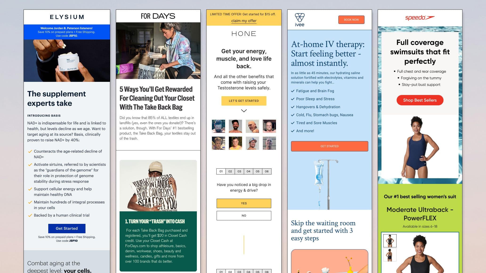
Audit & Inspiration
I evaluated previous pages and looked at landing page examples from similar product categories. I noted what worked, what didn’t, and identified opportunities to simplify choice, clarify value, and build trust.
Page Flow Strategy
I mapped the page from education → offer → trust → upsell. Each section was designed to reduce cognitive load, guide user attention, and highlight the high-value actions, like subscribing or opting into the blood test.
Iteration
I created multiple iterations for each section, experimenting with layout, hierarchy, and messaging. Feedback from self-review and inspiration analysis helped refine sections to be visually engaging while supporting conversion goals.
UX & Conversion Focus
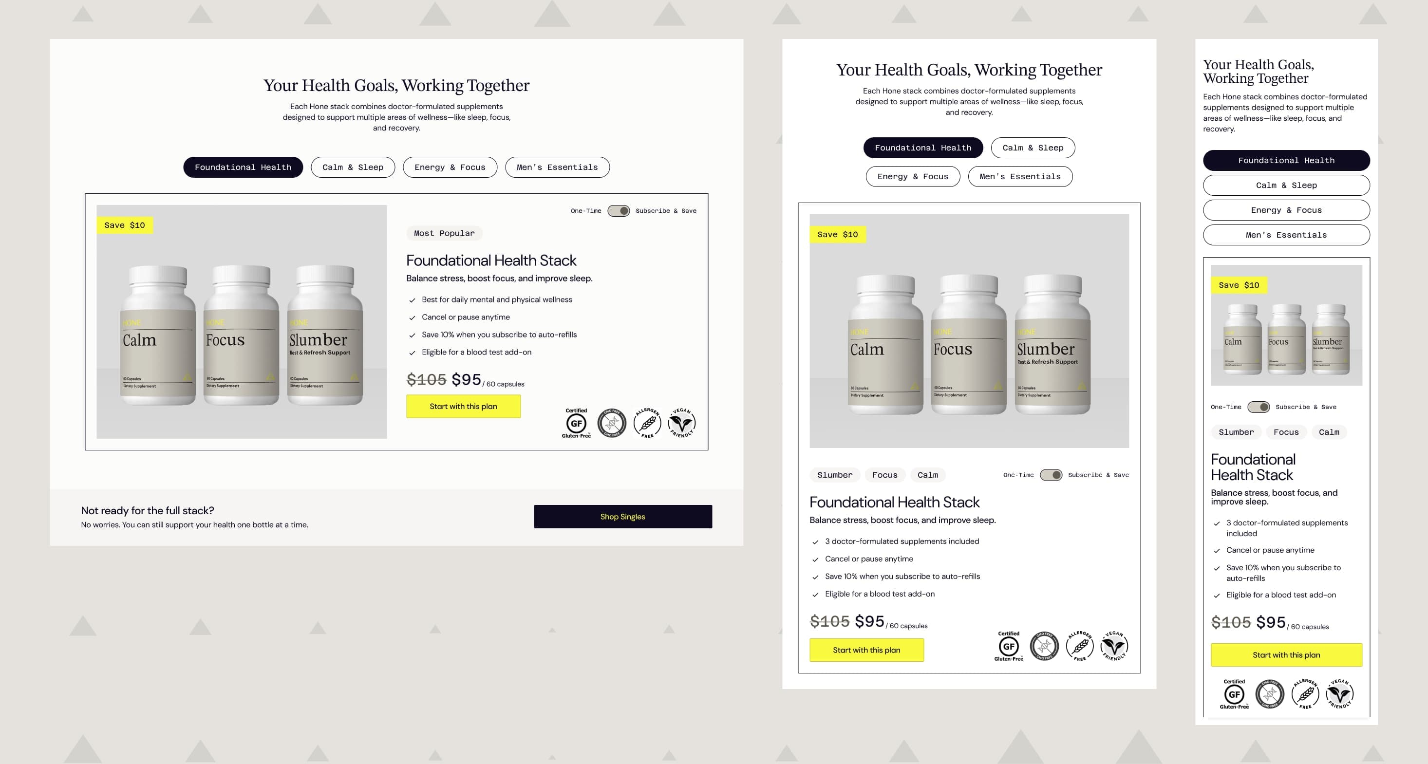
I prioritized a bundles-based layout to reduce analysis paralysis and increase AOV, even though Hone doesn’t currently offer bundles. I layered trust with iconography, real testimonials, doctor imagery, and clear copy. Pricing, default options, and toggle states subtly guided users to take high-value actions.
Performance Mindset
While this is a mock, I planned for iterative testing with behavioral data: scroll depth, click paths, subscription attach rates, and AOV. A/B tests would validate bundle vs. filter layouts and optimize the blood test CTA for location and language, ensuring the design performs as well as it looks.
Highlights
To reduce choice overload and guide users toward higher-value purchases, I introduced curated bundles grouped by symptoms or goals. The default emphasized “Subscribe & Save,” while One-Time remained optional. Savings were highlighted and selections simplified to make the decision easy and intuitive.
This section not only simplifies user decisions but also subtly drives subscriptions. Future A/B tests could compare bundles vs. a traditional product filter layout, and geo-based personalization could optimize the blood test CTA messaging for better conversion.

Opportunities
Audience Insights
If this were a live project, I’d want to dig deeper into the target audience. Are we reaching men in their 30s managing burnout, or older users interested in longevity? Are they skeptical, cost-conscious, or biohack-curious? Knowing this would help make content and CTA placement more strategic.
Data-Driven Iteration
Behavioral data like scroll depth, click paths, subscription vs. one-time conversions, and blood test attach rates would inform refinements. Which sections engage users? Where do they drop off? This feedback would guide improvements in layout, messaging, and trust-building.
Testing Priorities
Primary A/B tests would focus on bundles vs. a product filter layout and the timing/presentation of the blood test upsell. Dynamic, location-aware messaging could further reduce friction for eligible users.

